Evaluate previous website
Too many colors were used, making it feel lacking in consistency, and it was unclear where the user’s focus was meant to be. The design itself also didn’t feel modern and seemed a bit outdated. The biggest issue, however, was that users wouldn’t realize this website was offering English conversation lessons until they had scrolled down quite a bit.


Key points
Clarify what the website wants to communicate
Prioritize the information
Maintain consistency in the design
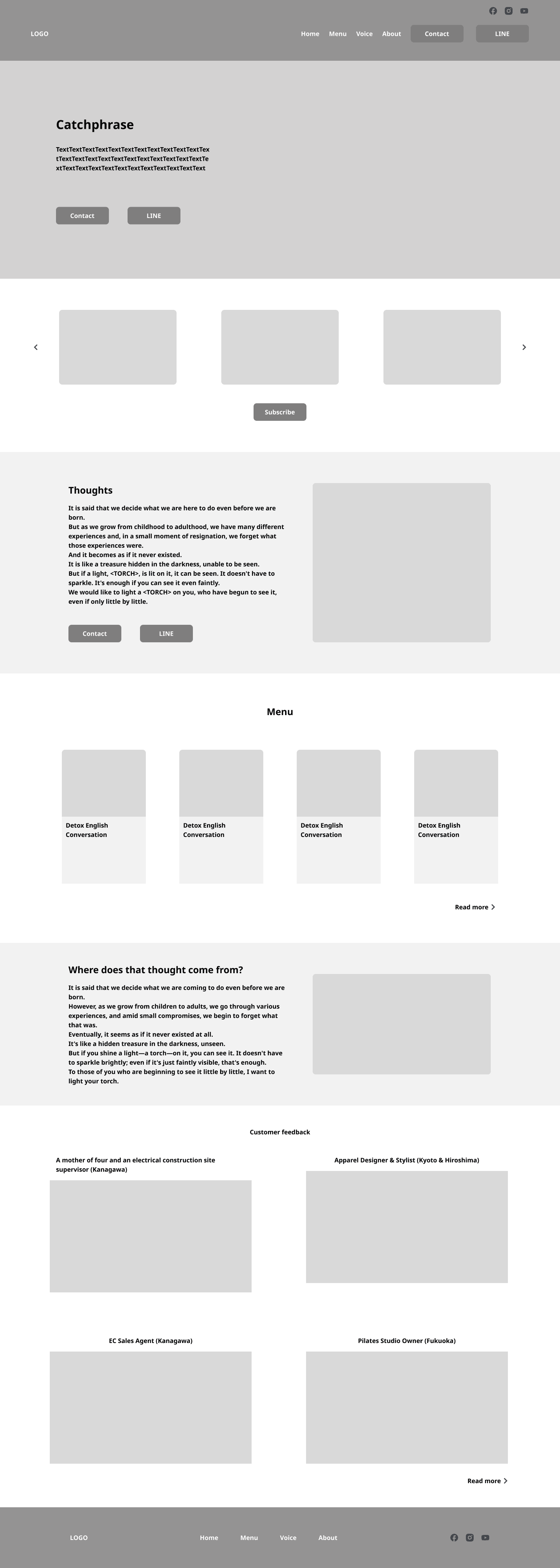
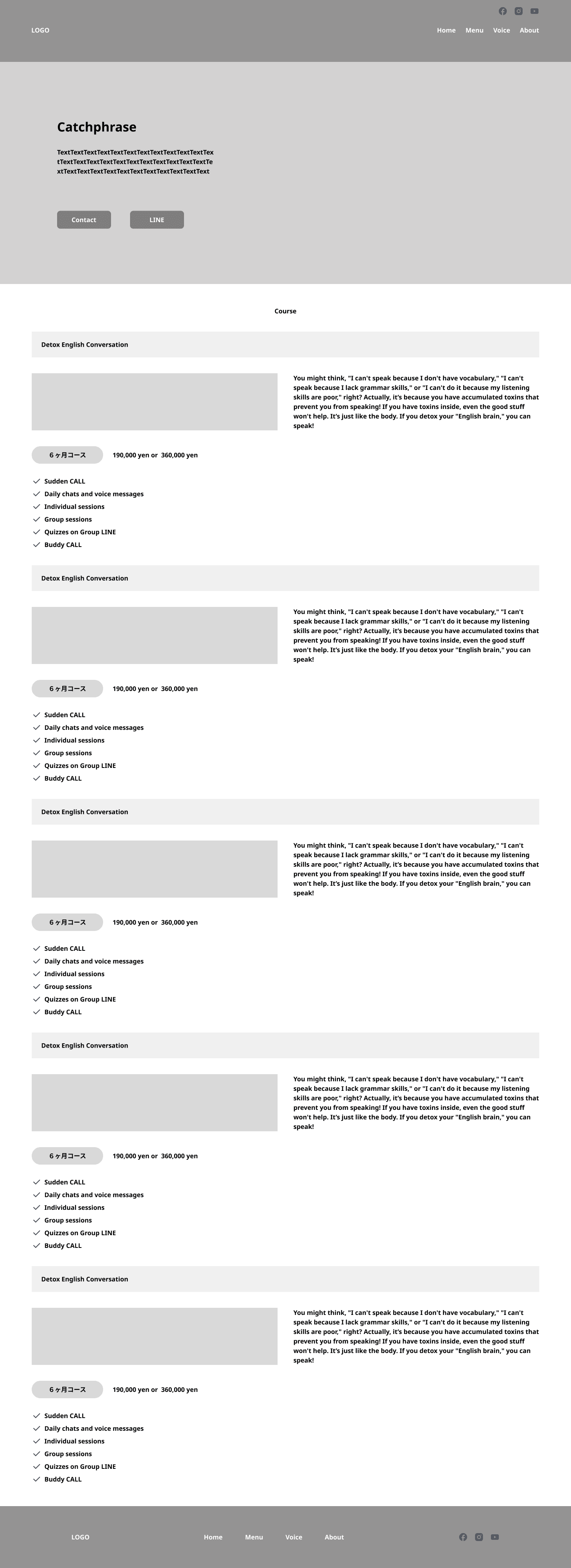
Wireframe
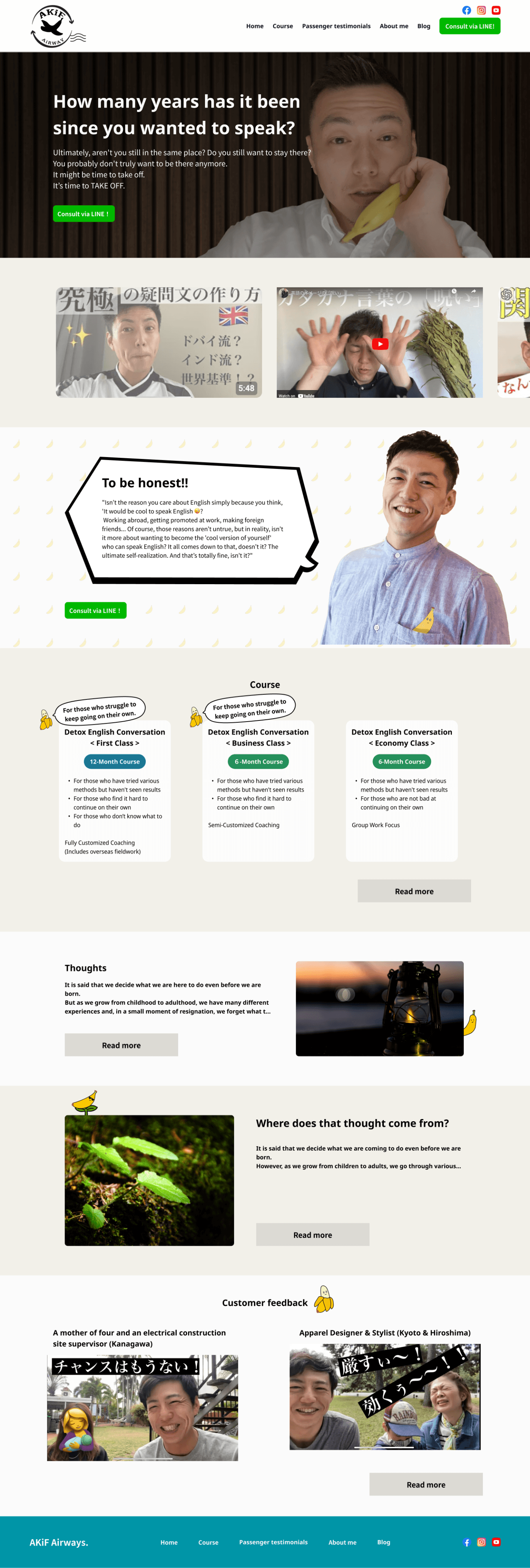
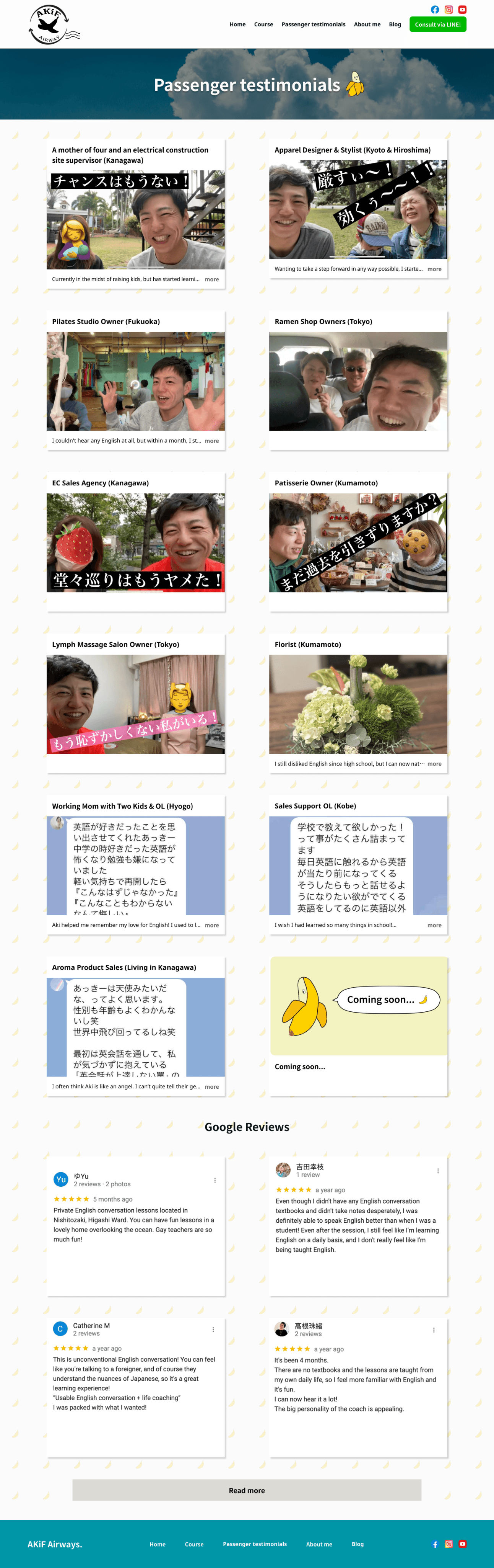
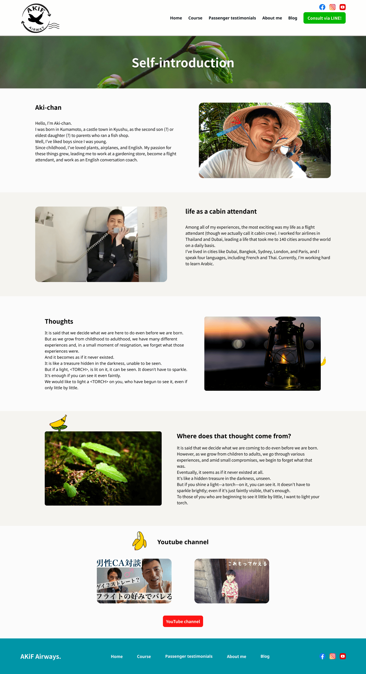
I combined the information from the existing website with new elements that the client wanted to add. These were arranged in order of priority, starting from the top of the page. Unlike its competitors, the client wanted to focus not on "selling English lessons" but on highlighting the uniqueness of the instructor and appealing to the specific needs of the customers. Therefore, I paid close attention to the arrangement of information to avoid coming across as pushy with the services.
Style guide
Typography
Line height and paragraph spacing for heading is 1.5 x font size
A
a
Heading
HEADING AND BODY
Noto Sans Japanese
Noto Sans JP is an unmodulated (“sans serif”) design for the Japanese language and other languages used in Japan. It covers Hiragana, Katakana and Kanji. It also supports Latin, Cyrillic, Greek and Hangul.
Colors
At the client’s strong request, the brand color was set to turquoise blue. Since they also wanted the overall look of the site to be extremely simple, no other colors were used, and it was unified with grayscale
Brand Colors
Primary
#0095A7
Secondary
#DCDAD4
Black / White
Black 1
#292929
White
#FCFCFC
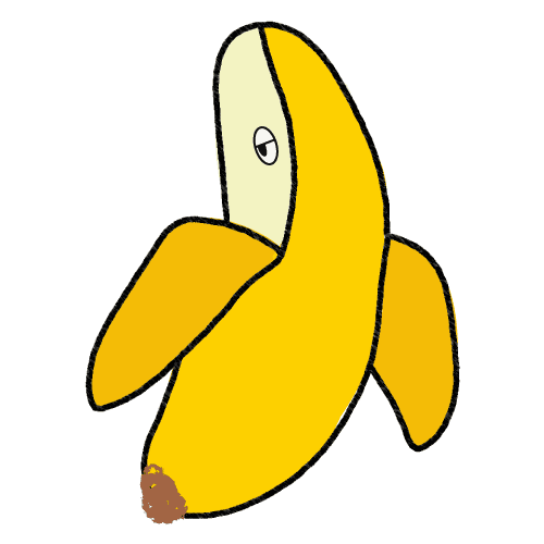
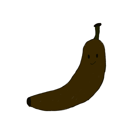
Character & Logo
Banana is the client's trademark and often appear on his YouTube channel.
So I designed several variations of the banana character and scattered them throughout the website.


?