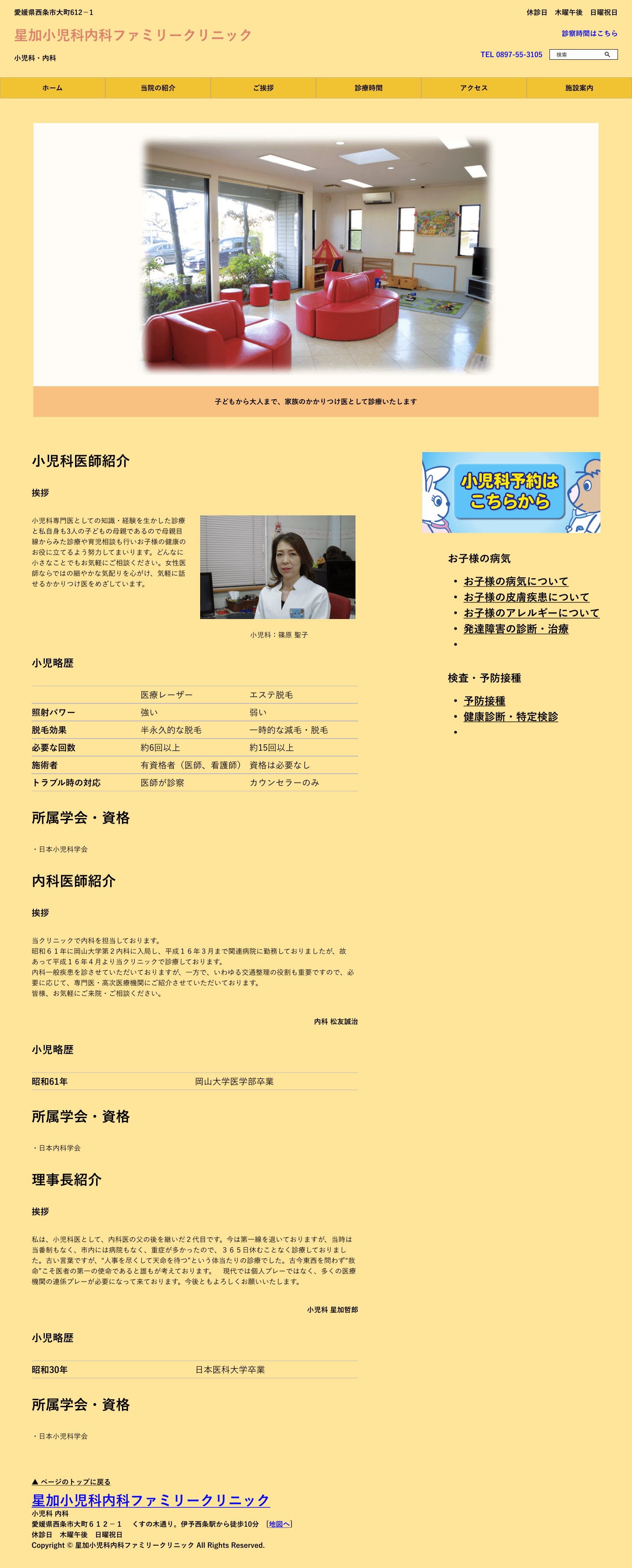
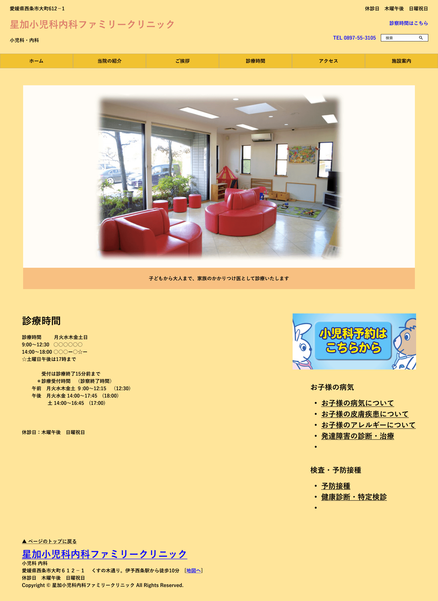
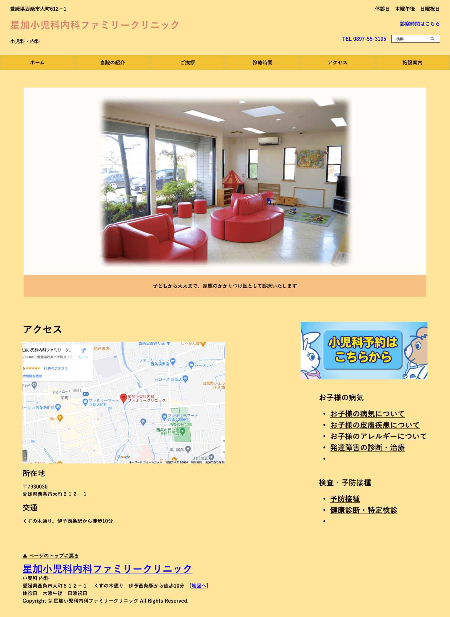
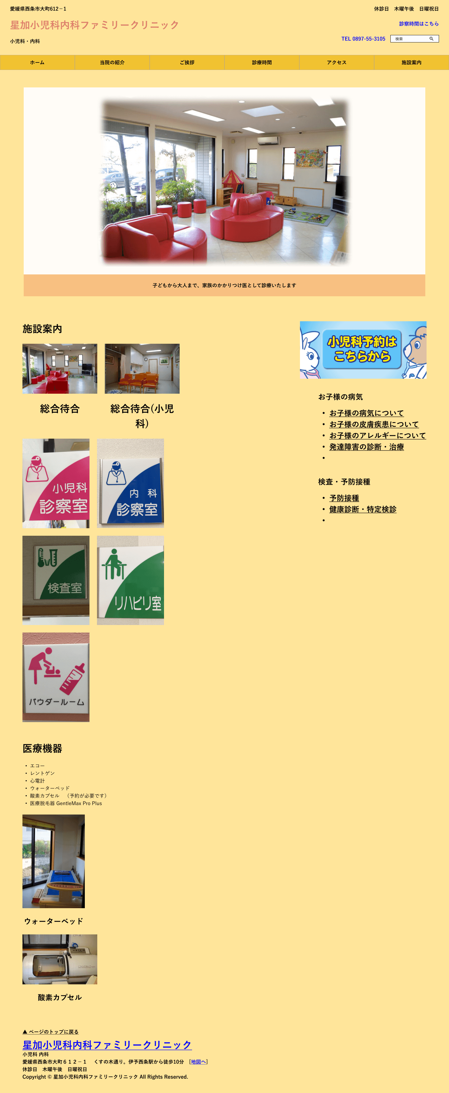
Evaluate previous website
Although the brand color of the old design was blue, the main color used was yellow, which seemed a bit too strong. There was no prioritization of information, and the text was colorful, which made it easy for users to get lost.

Problem statement
The old website had some visual issues, most notably issues with hierarchy and color.
Due to limitations of the server we were using previously, we were unable to adjust the overall balance, and there were many inconsistencies in alignment and text size.
Regarding color, all kinds of colors were used everywhere, giving the impression that the information was overwhelming.
Key points
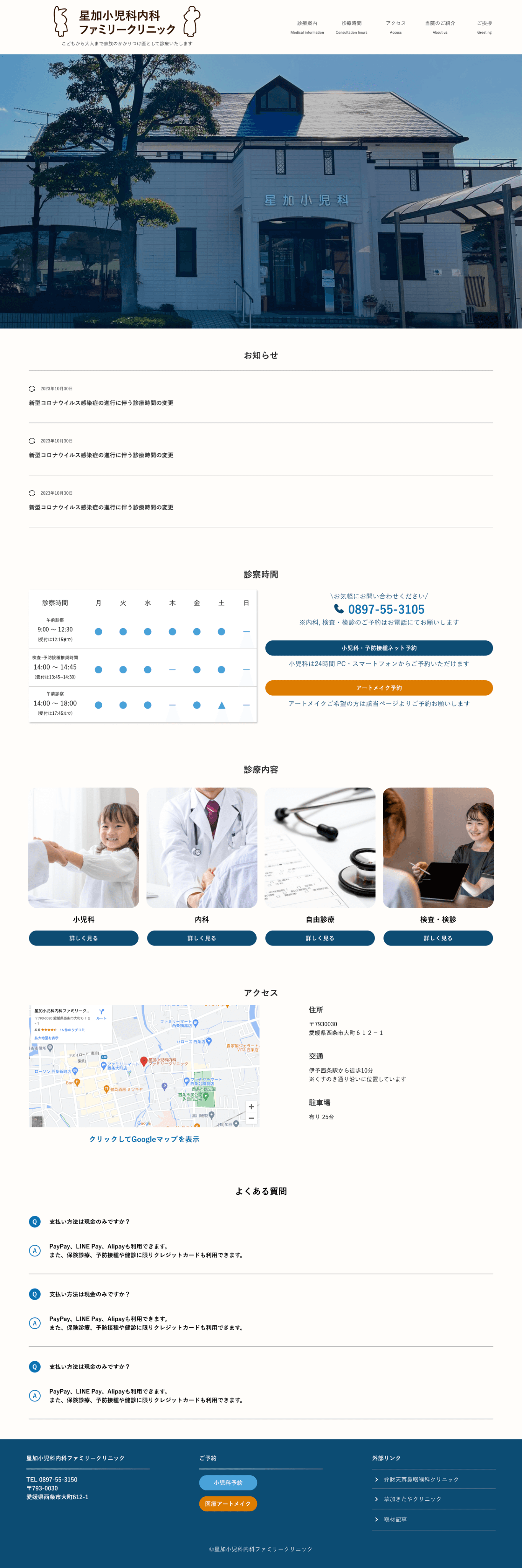
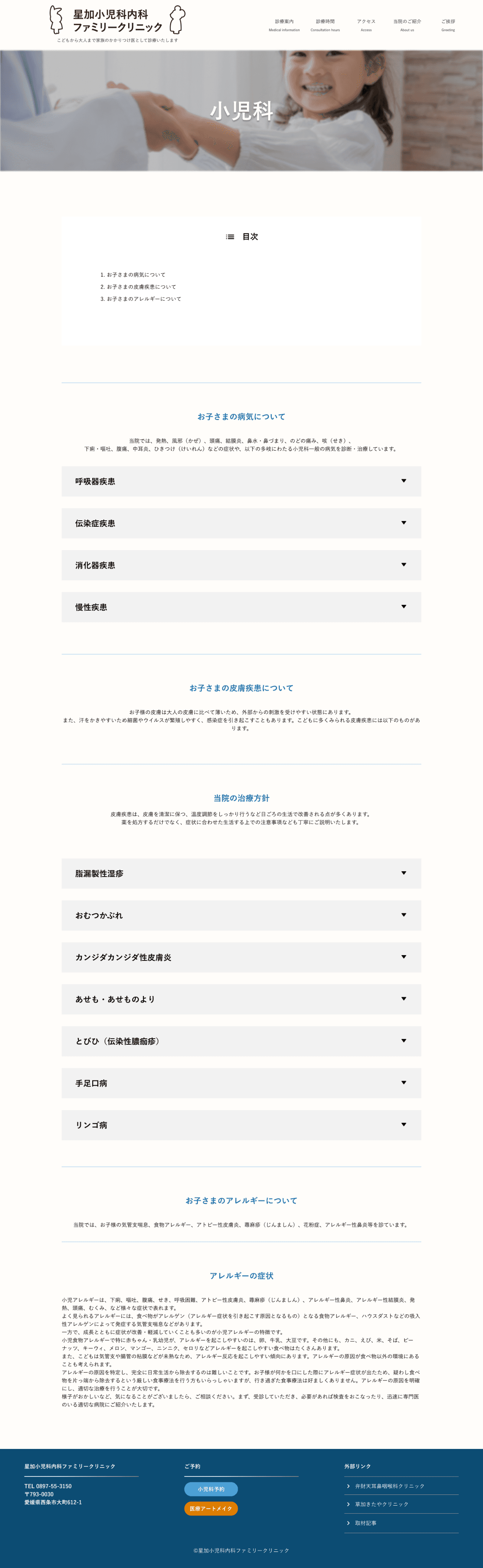
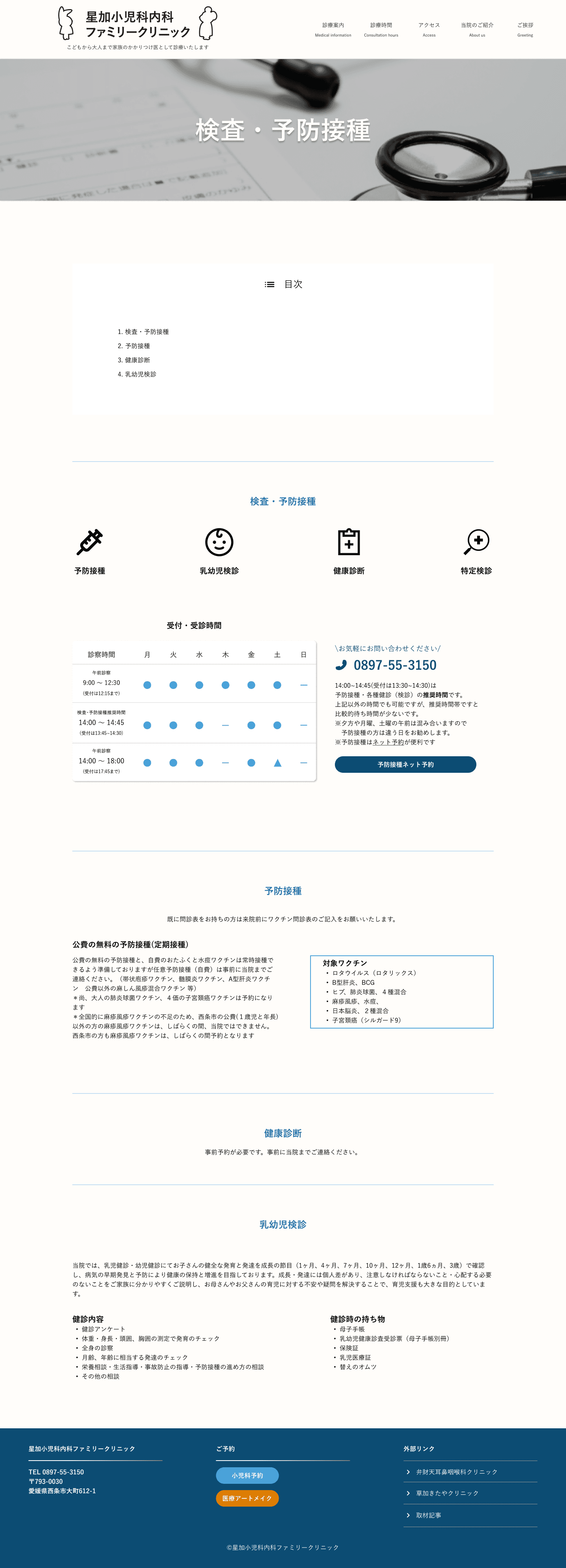
Create brand image
Organize information
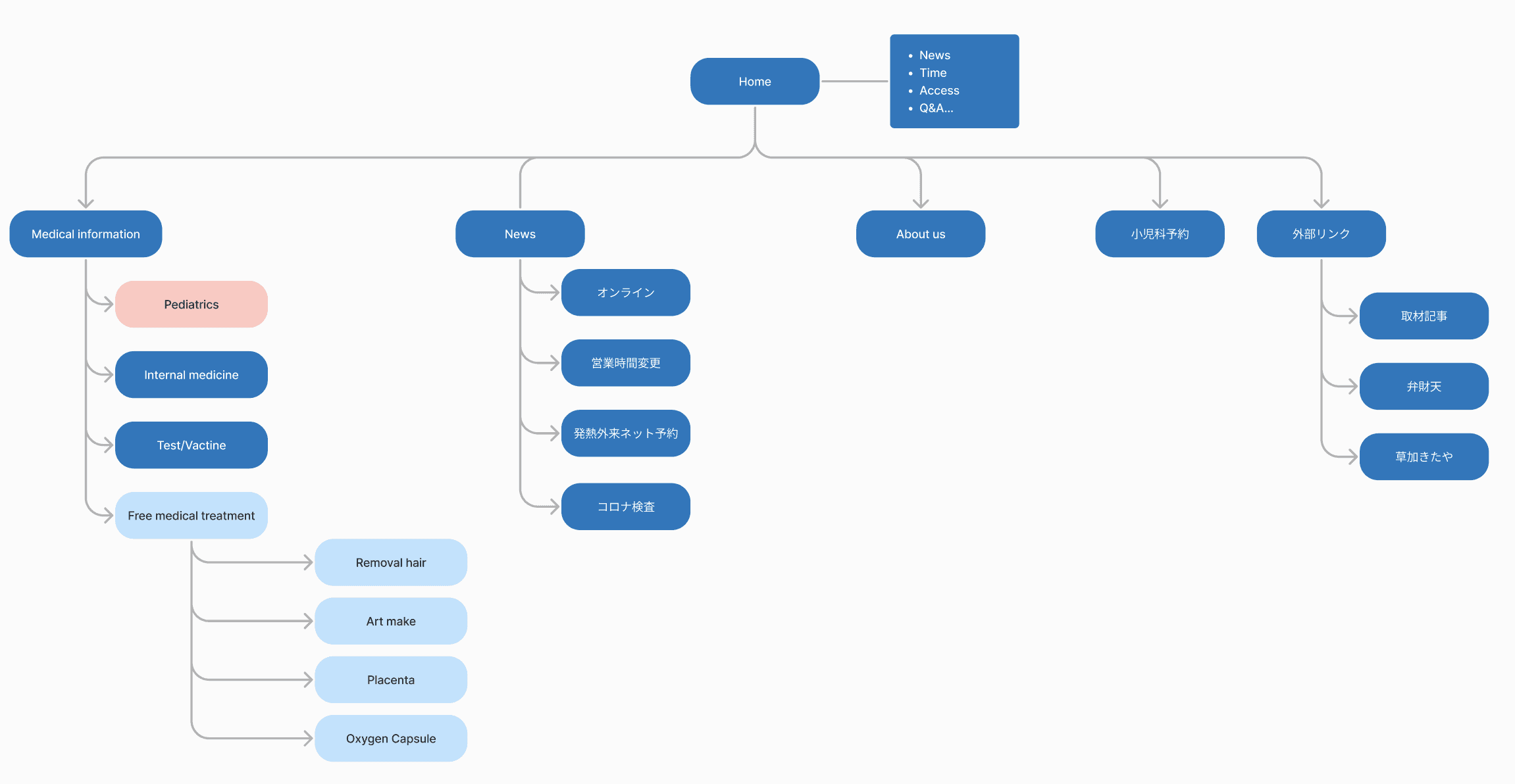
Site Map
The main menu was arranged in order of the most popular content for users, and grouped by related items. Each of the new business items, which are elective medical treatments, was created on its own page, allowing for accurate information to be delivered to specific users.
Style guide
Typography
Line height and paragraph spacing for heading is 1.5 x font size
A
a
Heading
HEADING AND BODY
YuGothic
Yu Gothic is a standard sans serif type family designed to be highly readable for setting a large volume of text.
Colors
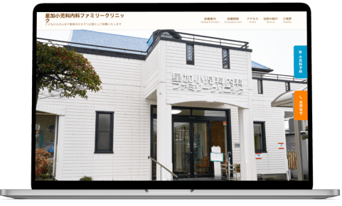
The brand color is blue, which gives an image of cleanliness and reliability.We used a lot of white and blue on the web page to match the clinic's exterior.
We used a yellowish orange as an accent color.
It stands out well because it is a complementary color to blue.
Brand Colors
Primary
#49A2D9
Secondary
#0C4C73
Accent
#F29F07
Black Colors
Black
#292929
White
#F8F8F8
Character
The characters used on medical cards and signs have been updated and are available in a variety of poses, making them easy to use anywhere.


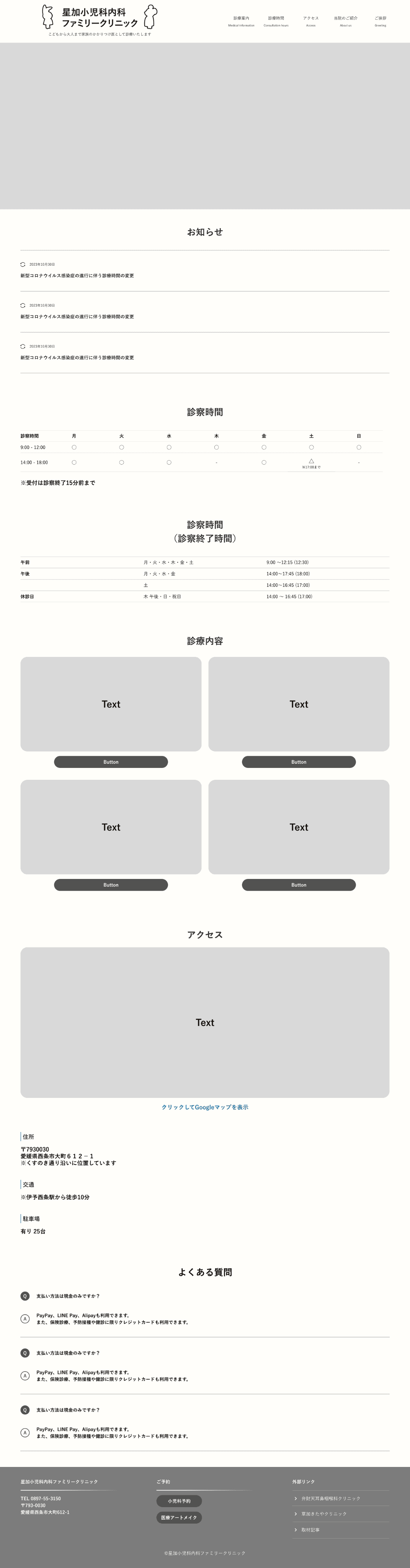
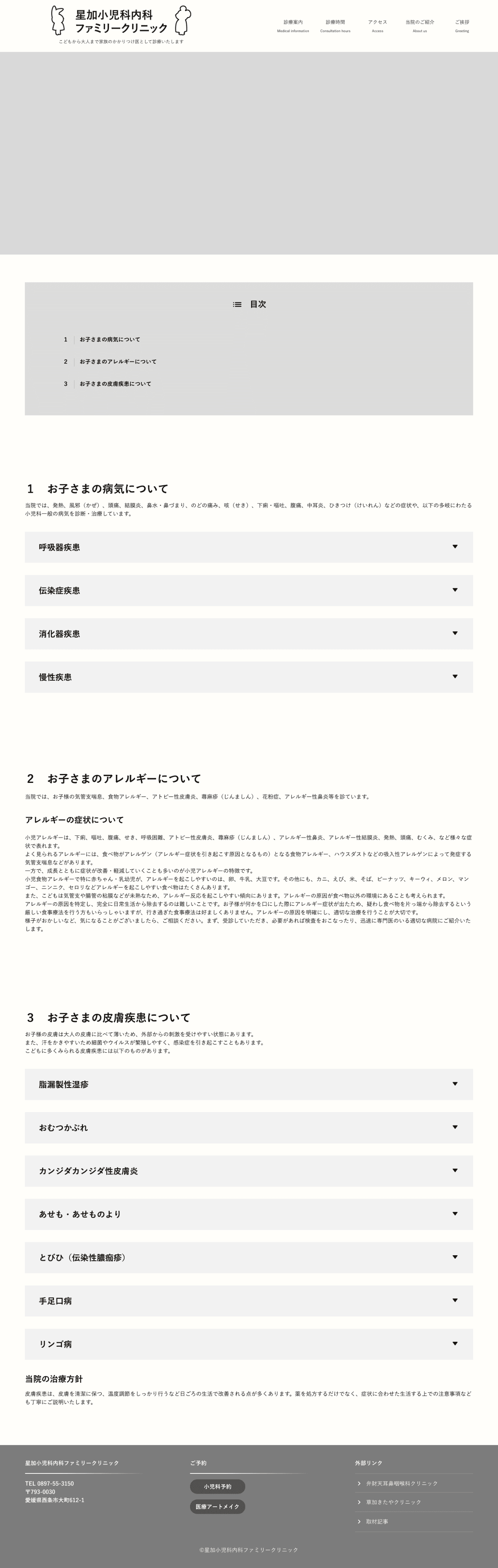
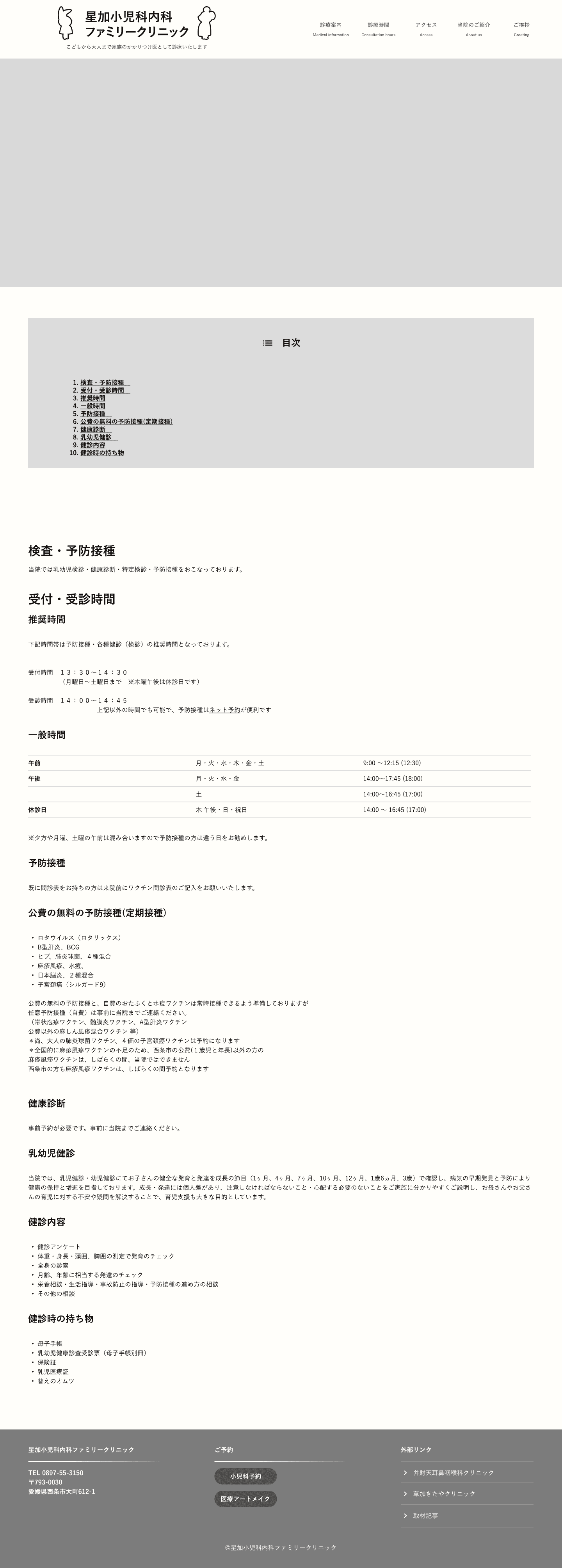
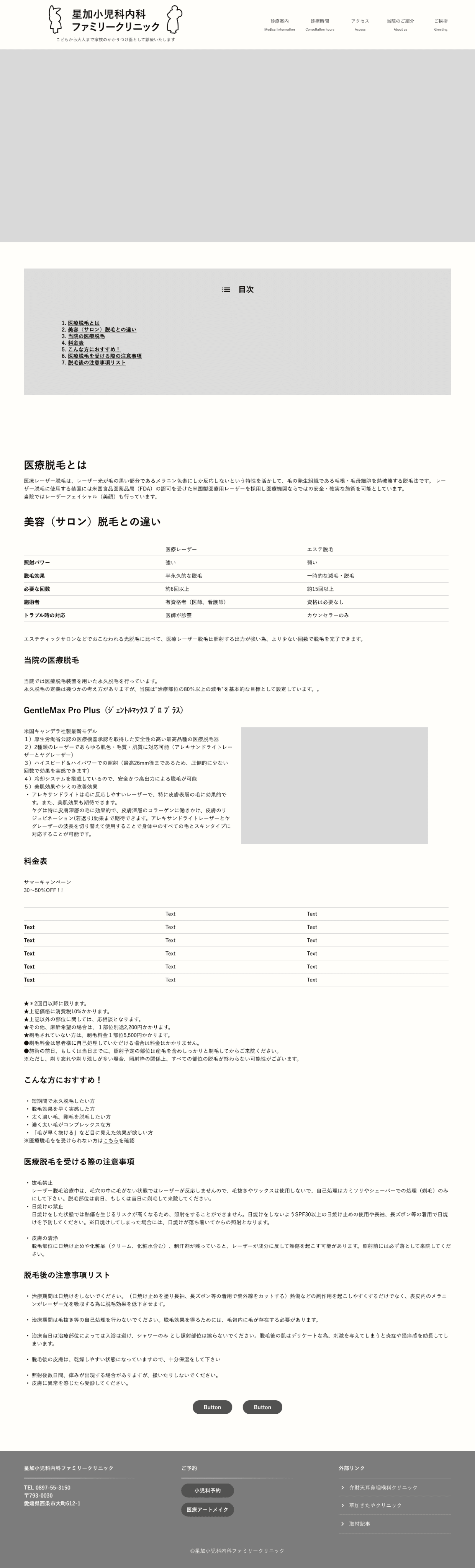
Wire frame